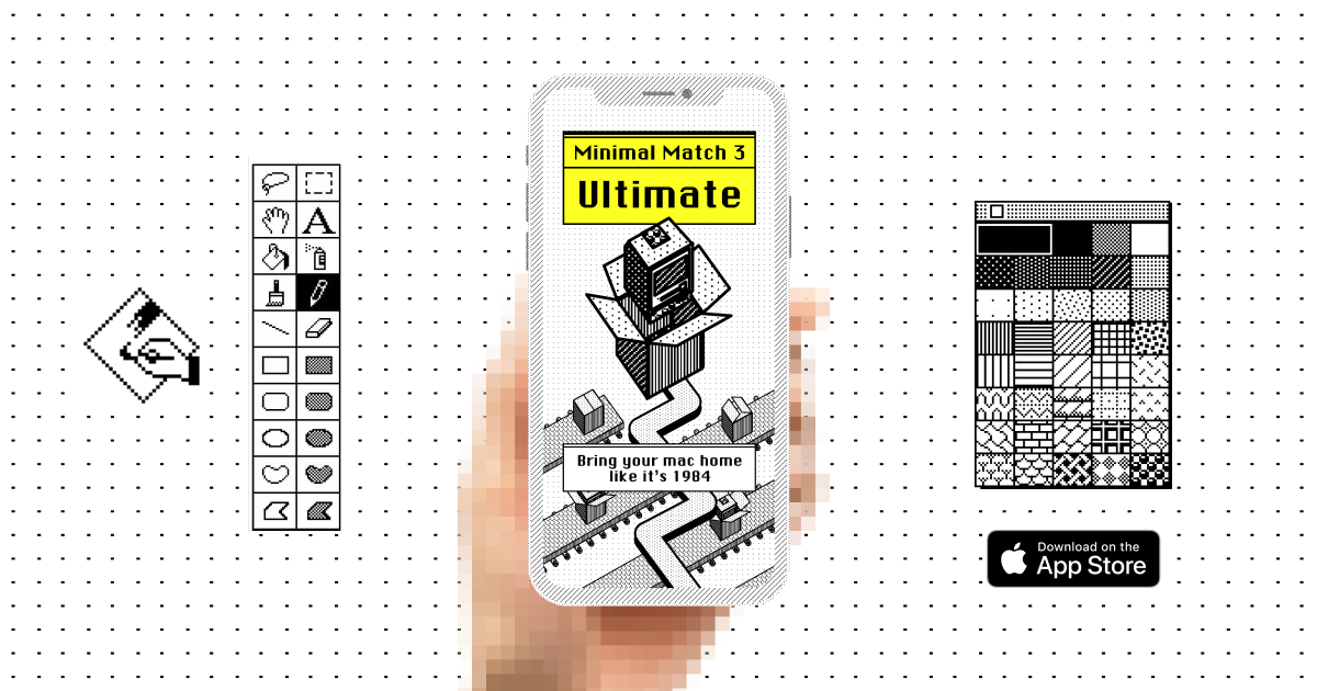
Designing a puzzle game in MacPaint from 1984 for the iPhone X
Designing a puzzle game in MacPaint from 1984 for the iPhone X
Imagine designing the UI for Candy Crush Saga — a match 3 game, on the original Macintosh in all its black and white glory.
Pixel painting
I usually spend my time designing beautiful flashy digital products in the latest software, for the latest devices.
But not this time.
I remember designing on our first computer. I spent hours drawing extremely large images in Windows Paint performing a kind of pixel painting (what ever happened to the spay can tool?). I would then print the paintings out on a dot matrix printer inch by inch on an endless roll.
One day while halfway through a massive tiled print (intended to cover my wall), the computer beeped and froze up. It never did turned on again.
But the images I created are still stuck in my mind over 20 years later. Black and white murals drawn pixel by pixel.
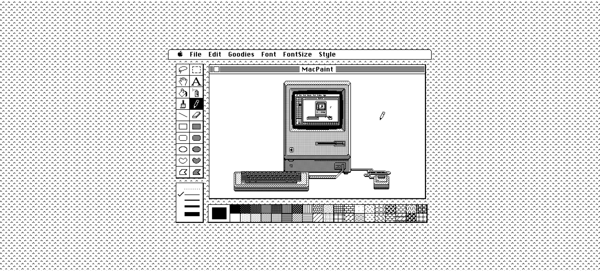
As it turned out there was no colour, no grey even. Just black, white and hatch.
AutoCAD → MacPaint
When I started this mobile game created using Paint I thought about using engineering software, AutoCAD in-particular. You see it has this 80’s dark hatch inverted style—it literally looks like the 80’s (and still to this day look like that).
AutoCAD was the original Dark Mode
The strong vector graphics and implicit dark mode made it look instantly retro. The problem is unless you used AutoCAD you wouldn’t have any nostalgia for the graphic style or UI.
Enter MacPaint.
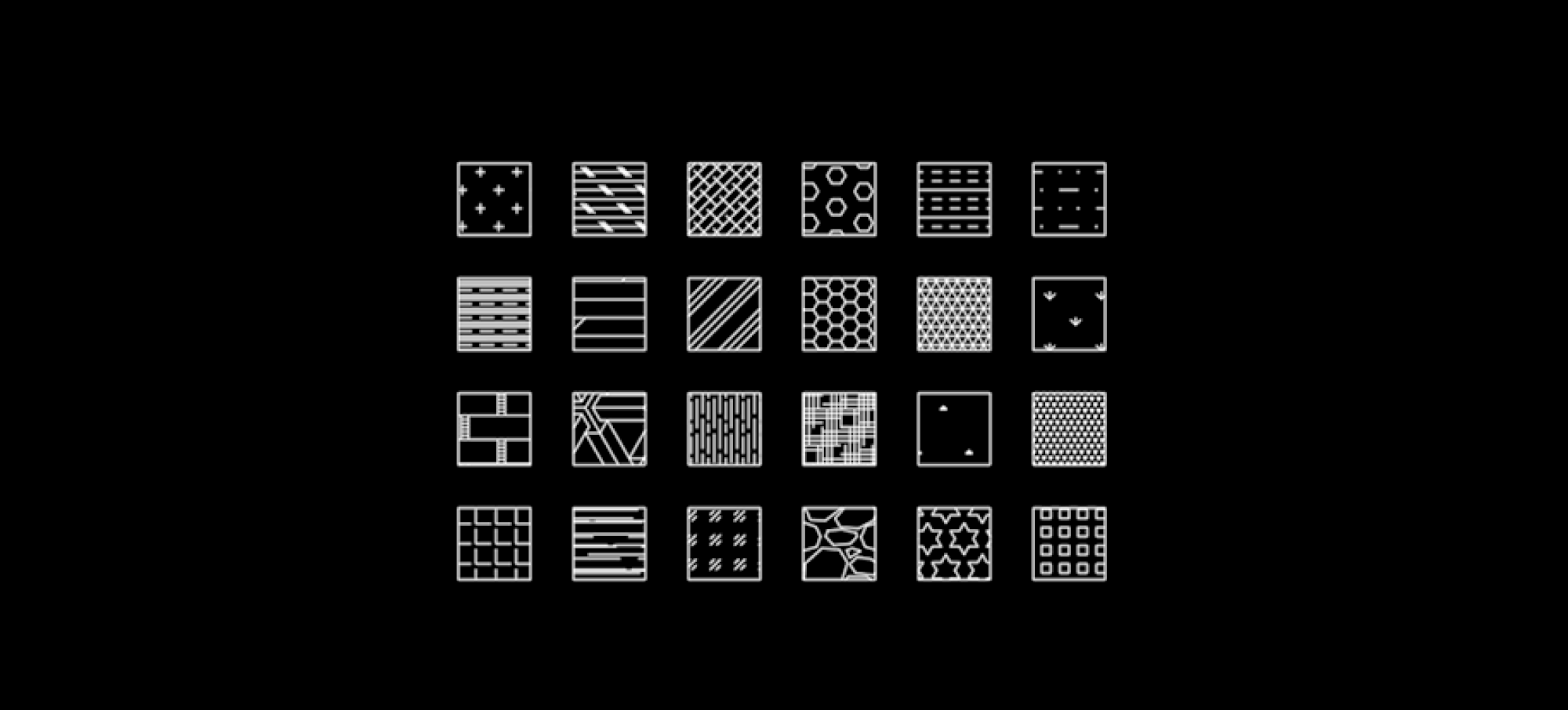
Back in the day all the operating software desktops had background patterns—repeating patterns made of small tiles. In actual fact they are repeating hatch patterns similar to AutoCAD.
Most people don’t remember them but they did see them each time they booted up an original Macintosh.
First it didn’t start, and then it caught on fire
I had the pleasure of booting up an original Mac and customising the background pattern—yes you could create your own hatch pattern.
Unfortunately the Mac soon caught on fire 🔥, followed by dark grey ominous smoke
As I destroyed my second vintage piece of hardware messing with pixel art (amazingly the Mac actually survived the ordeal and continued to operate) I reminisced about real pixel art. The kind of art you only had a few pixel for, and a couple of kilobits of storage to save each masterpiece.
Painting with pixels
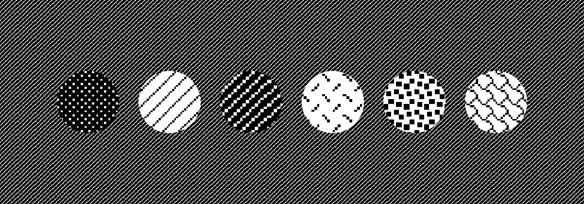
Without access to the a working Mac I started to reproduce the hatches as fill patterns. In Figma. Think of Figma like Photoshop or Illustrator.
The process was to reproduce hatch patterns and tile in them as Fill Images, similar to how the ‘Fill’ tool worked in MacPaint.
From here you could switch out the hatch pattern to whatever you wanted, keeping the hatch scale at 200% would keep a consistency of scale.
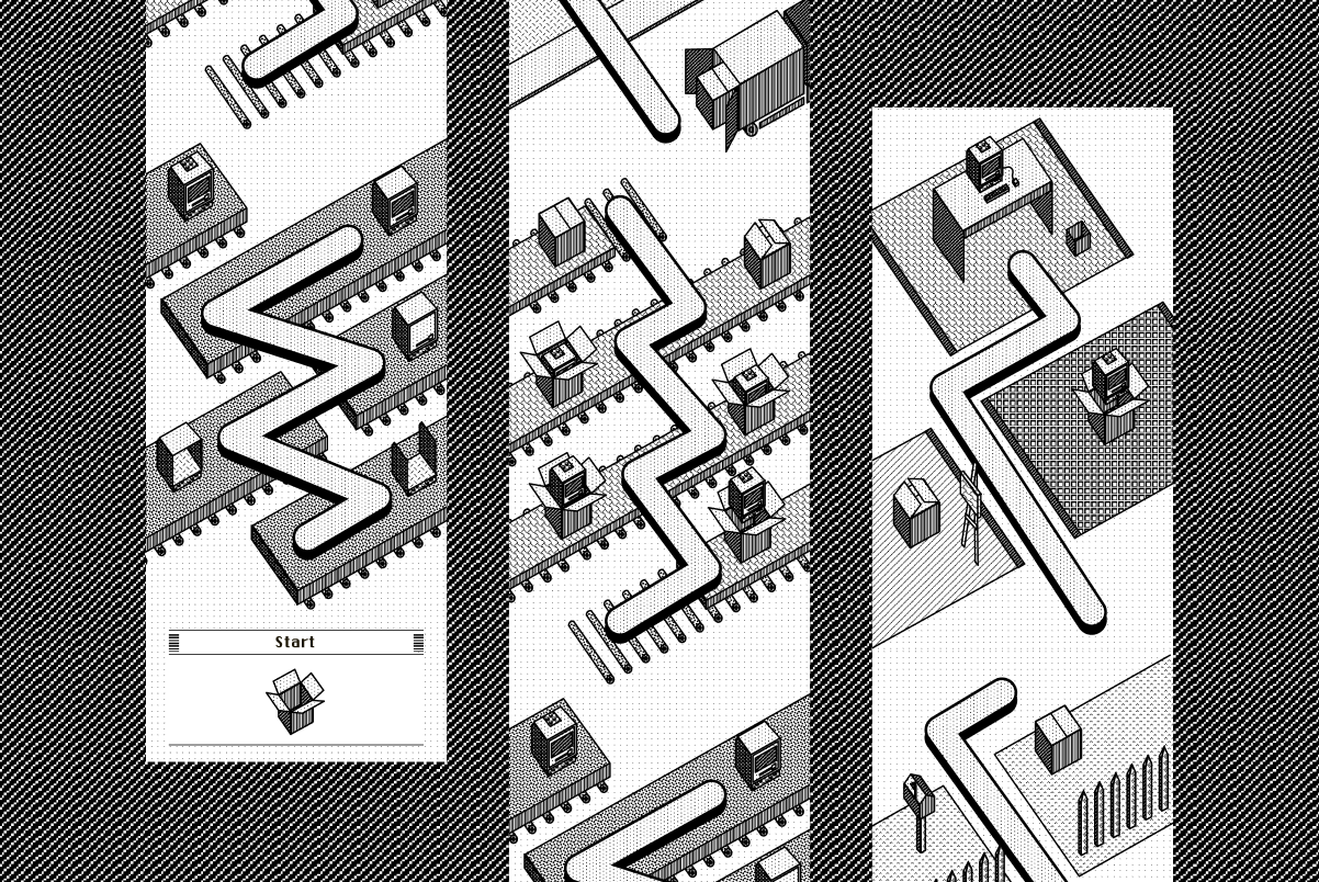
This hatch fill style was then combined with an isometric angle drawn in think outlined scalable vector graphics.
Although not completely authentic the isometric style has a heavily skewed angle emphasising retro feeling.
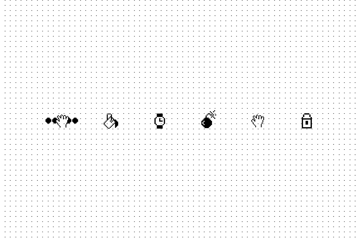
After drawing a box opening animation, it reminded me of 8-bit pixel art animation sprite sheets. So the next task was to draw 2D pixel icons for the game UI based on early Mac and Windows icons.
Finally the ‘Map’ screen was built out using all the techniques combined to create a journey mapping the Macintosh from factory floor to home delivery.
This new style blended a bunch of styles that all felt retro and where indeed possible back in the 80’s from an artwork perspective.
What makes this style unique is its sharpness in the vector artwork mixed with low resolution hatch styles—exactly like AutoCAD.
Finishing touches
The artwork was created for a puzzle match 3 game, a ‘candy like’ if you will.
Puzzle games where matching is the goal usually use gems or bright coloured candy as the main UI elements, so adapting this new b&w style was challenging.
Notes on 80’s hatch pattern art:
- Use one consistent size of tiling hatch patterns
- Use as many constraints as possible — not having access to colour or even greyscale made decisions easier.
- Use hi-resolution or vector graphics if you can
- Be authentic, but use contemporary tools
- Do your research — I would have used concrete patterns from AutoCAD if I didn’t look for better hatch styles
- Combine styles—the isometric angles makes the artwork unique.
Conclusion
Using limited tools to create content provided one of the most fulfilling and fun projects I’ve worked on for a while.
I forgot how satisfying it is to create arbitrary constraints and bend and mould them to your will. If I was to repeat the process I would extend the constraints into other parts of the project, like gameplay or progression etc.
The truth is everything that is old-is now new again, the combination of old and new technology is not just nostalgic, it pays homage to the technology that created it—it’s all for the love of Mac.
>em class="ld"> committed to crafting minimal experiences.
Minimal Match Three Ultimate is available on the Apple App store for iPhone and iPad, and playable in browser on itch.io
Leave a comment
Log in with itch.io to leave a comment.